


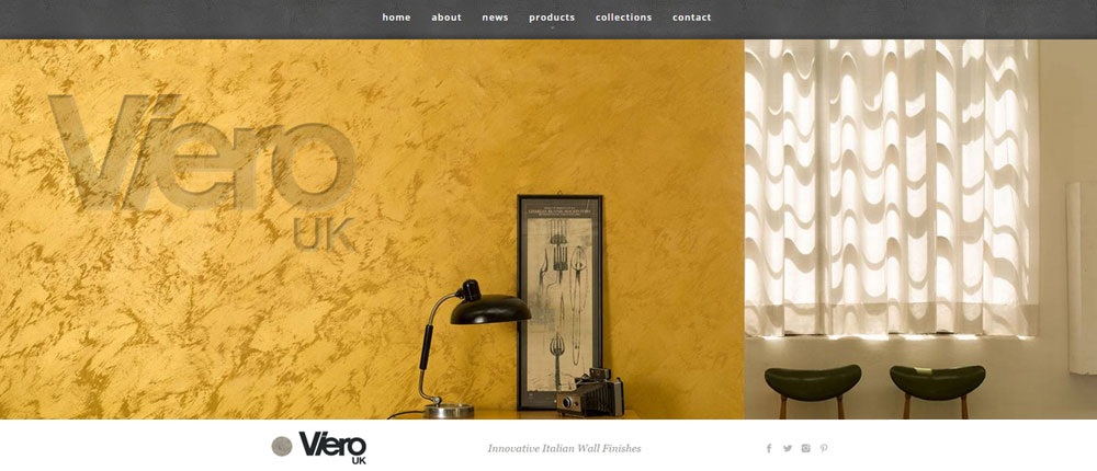
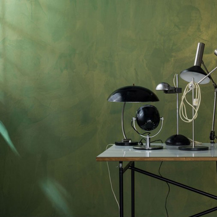
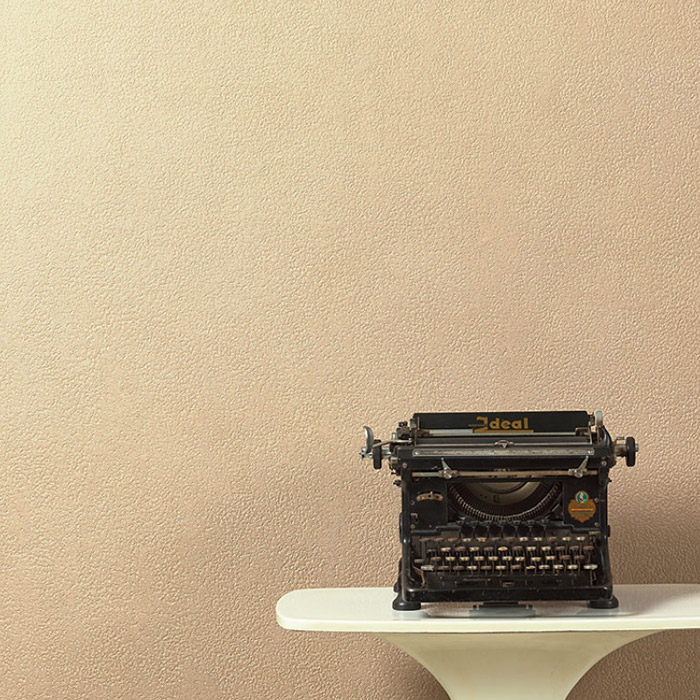
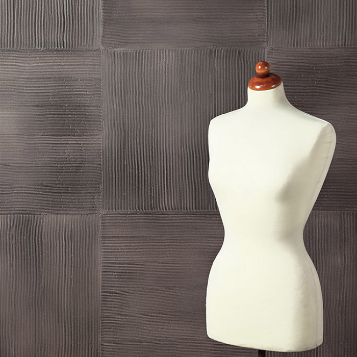
Viero UK are distributors of innovative Italian manufactured wall finishes. The plaster finish allows genuine creativity and has no limits with regard to colour, texture or thickness. This makes it possible to attain any required surface: smooth or textured, geometric or abstract, glossy or matt, old or new look.
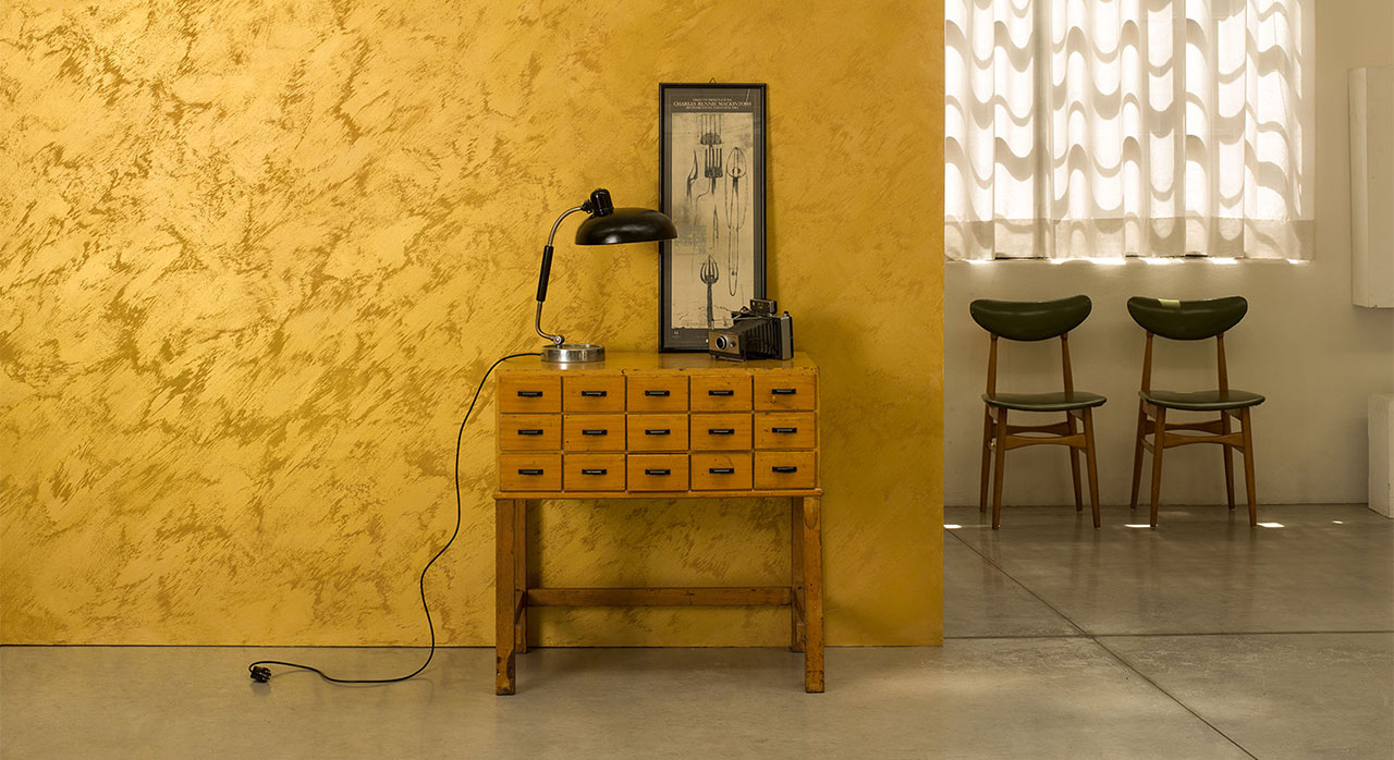
The products flexibility creates so many combinations that each application can be totally unique, and therefore provides architects and interior designers with the ability to offer a truly bespoke product. The client’s brief was simple, to design and develop a fully content managed, brochure style website to promote this exclusive product.
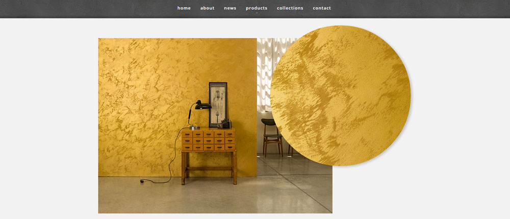
The use of large prominent photographs providing examples of the different colours and achievable effects were to be a mandatory feature of the design. We also needed to keep the brand recognisable and in line with Italian parent company’s website and those of other European distributors.
Keep the navigation simple and ensure that the overall fee of the website is appealing to potential customers who may include architects, builders and interior designers as well as property owners.
As the parent company already had a website that our customer was happy to replicate, the design of the website, whilst different from that of the parent company, was a reasonably simple process as we did have a layout in which to follow. That said the Italian website isn’t responsive, and therefore our design also needed to consider the layout of a responsive structure.
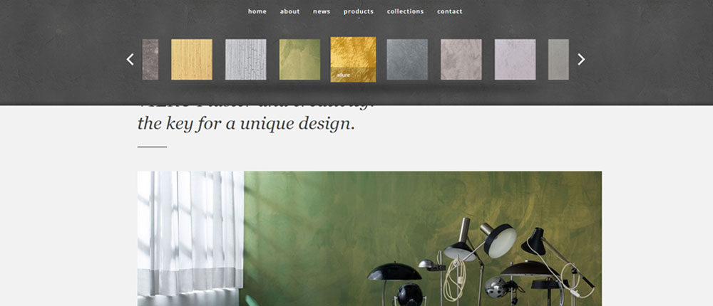
Whilst the website needed to have simple navigation, there is also a lot of technical data which needed to be available to view and download by the trades people who will be applying the product. We therefore created a dedicated page for each finish in order to provide the technical information of that particular product. This information can be viewed online or alternatively downloaded as a printable PDF document.
As this polished plaster product is new to the UK, it was important to have a very visual, image lead website in order to assist the company’s sales team when promoting the product to architects, builders and interior designers. This also then provides a portal for these people to direct their potential customers to (essentially the end user).
We achieved this by creating an image slider in the header of the site. The slider uses a number of full width photographs to show the applied finished product in a number of different situation, and using various colours and textures.