


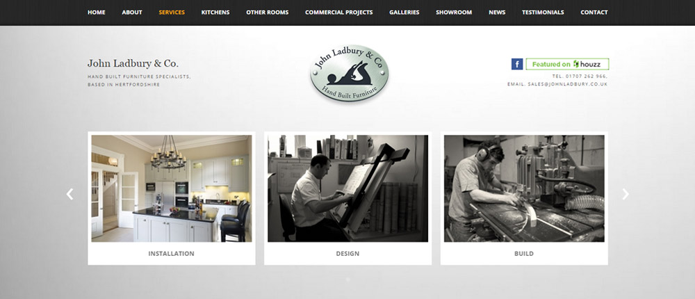
John Ladbury are a hand built furniture specialist, primarily offering the design, build and installation of bespoke kitchens�.and one of a few customers who have been with us from our first year.
Over the years, John Ladbury have regularly updated their websites to prevent their site form looking dates, and to ensure they are taking advantage of new design features and development technologies that will help them project the professional image of the business.
When we contacted them to explain the need for a 'responsive' website, due to the huge increase in website browsing via mobile devices, such as tablet computers and smart phones, they immediately understood both the necessity and benefit of redesigning the website.
As we were coming up with a new design, it was a good time to remove anything that was no longer relevant and add areas new to the business such as 'Commercial Projects'.
Over the years we have also managed to get them on the first page natural listing of Google, under many specific and generic key search terms such as 'hand built kitchens' and 'bespoke kitchens'. It was therefore very important to the business that the new website didn't negatively affect their search engines rankings.
As John Ladbury had recently started offering contemporary kitchens, as well as the more traditional kitchens the businesses reputation has been built on, it was important that the website design presented a modern look but without ignoring the traditional aspect of their business.
John Ladbury's core target market is high end, and so just like in the four previous website we had designed for the Hatfield based business, this website needed to ensure this was projected across the design of this incarnation of the site.
As an established business and website, we felt it was also necessary to keep a similar look and feel as the website this would supersede.
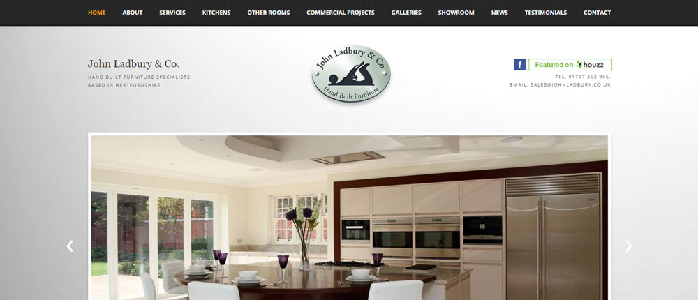
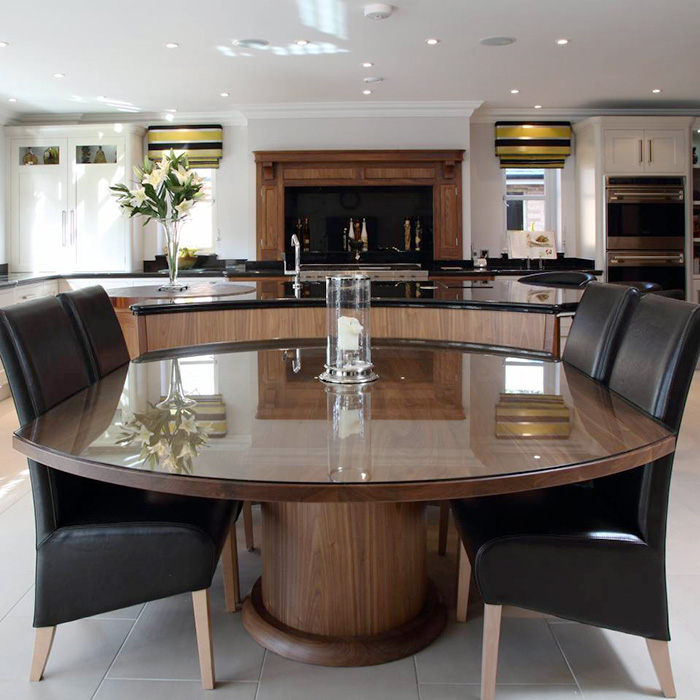
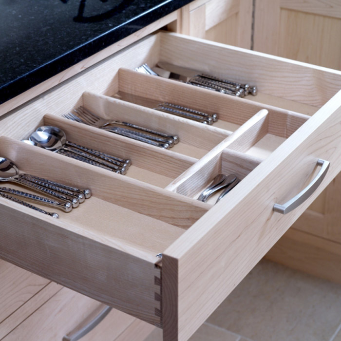
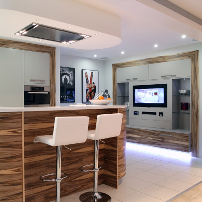
We also wanted to take advantage of the fact John Ladbury do get many of the finished kitchen professionally photographed, and as 'a picture paints a thousand words', came up with a design which made these images the focus of the site. By then adding a scrolling facility, a visitor to the website would get a good understanding of the type and quality of hand built kitchen available form John Ladbury, without having to look around the website.
This 'less is more' image lead theme continues throughout the site providing the contemporary feel that the company was keep to project in order to help promote the more modern kitchen builds that have recently started to offer.
Finally, as we do with all website re-designs, we carried out a page linking process to ensure that the site doesn't lose any of the essential search engine link juice, which has been built up since their first website in 2001.