

Acoustik is a modern and dynamic musical duet, specialising in weddings, parties and formal and informal corporate and private events.
"Don't waste your time looking at other web design companies, AWD are worth their weight in gold! "
Booking AWD to build my website was by far one of the best decision I've ever made!
I cannot stress how fantastic the whole team have been. What makes AWD such a brilliant company is their personal yet professional service.
Not only were their concept designs spot on but they also came up with unique ideas and ways to make my website stand out.
Building my website was an enjoyable journey and most importantly totally stress free.
Don't waste your time looking at other web design companies, AWD are worth their weight in gold!
Read in full
Acoustik approached us after several months of frustration using the cheap website builder, Wix. Having experienced just how limiting this web provider was for them in expressing themselves creatively online, as well as the inability to locally host or play their music, they eventually decided to go bespoke.
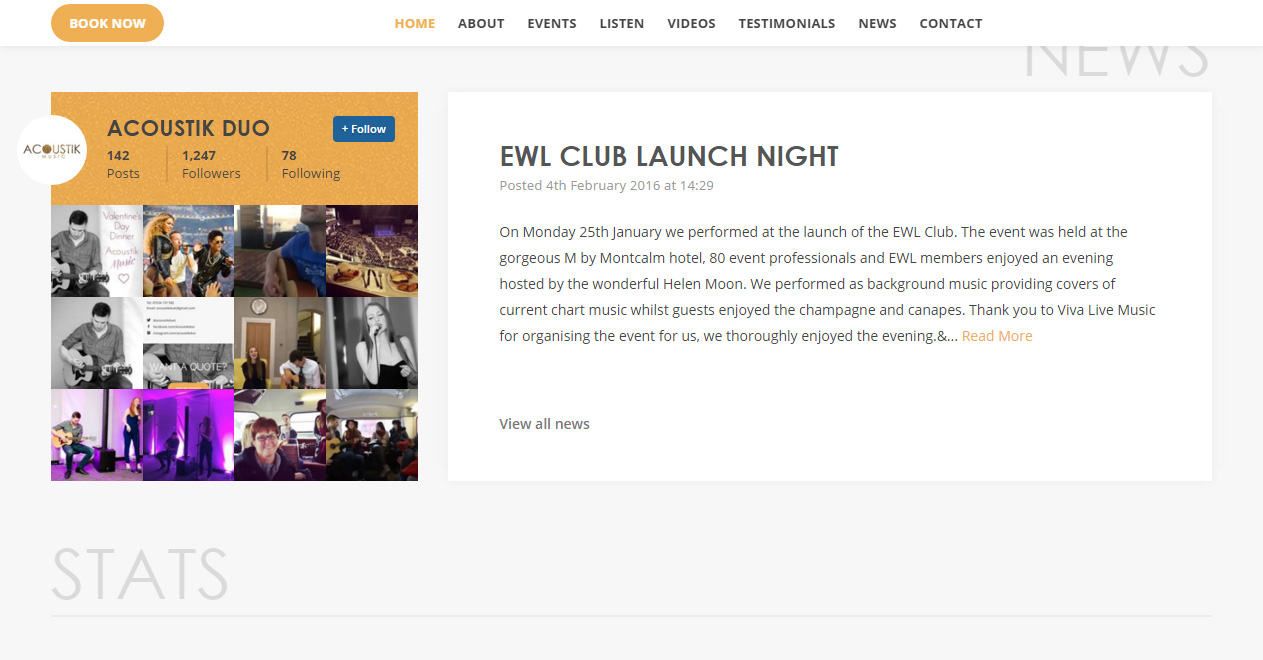
The brief was relatively simple – a compact site that with would allow them to connect with potential clients and showcase their music. The site would allow them to host music and videos that customers could play, as well as allow them to post blog updates and have integrated social media – both features lacking on their last website.
But as with all many of our briefs, whilst what was asked for was quite simple, we strived to delivery something that was far from ordinary, and well above what was expected.
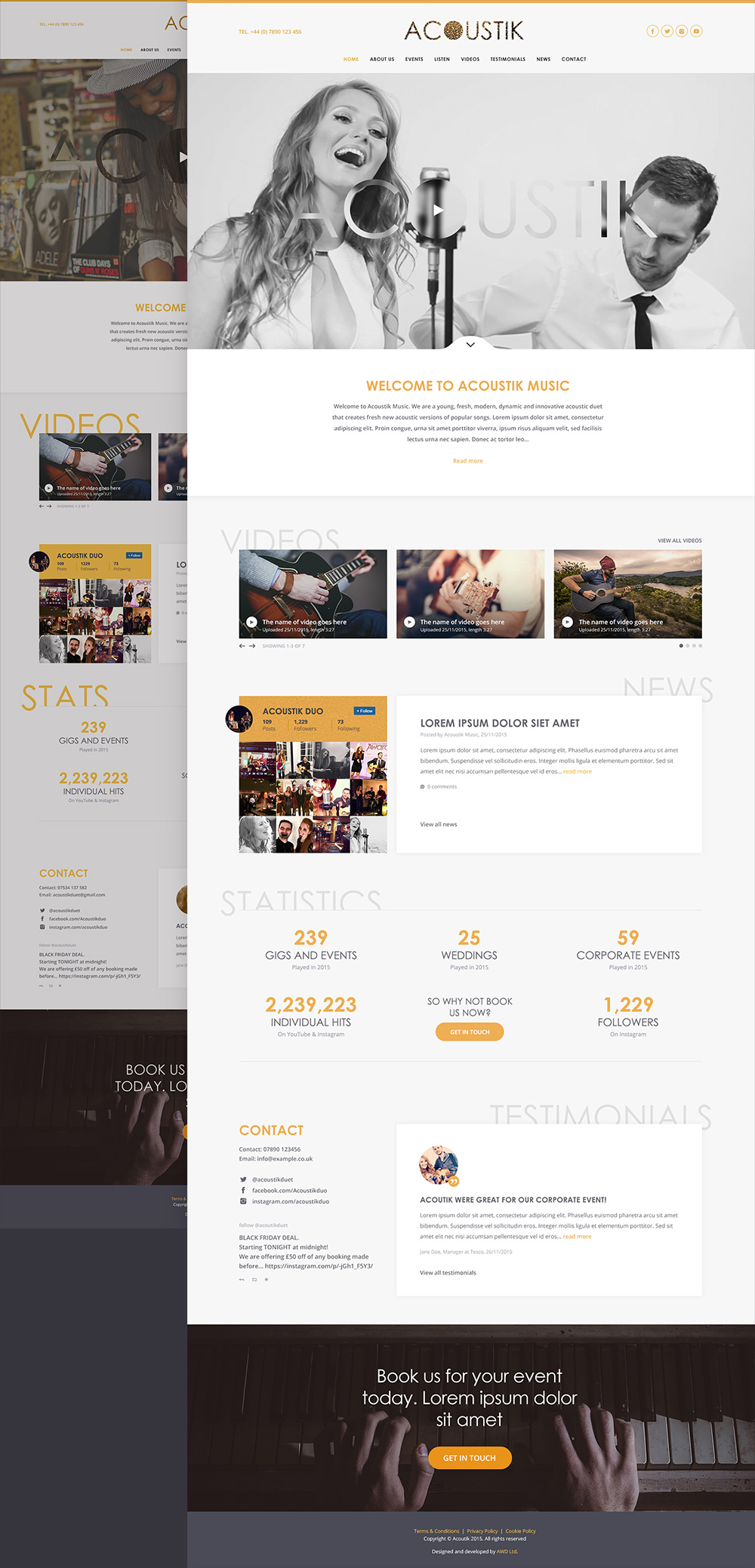
The first step was to come up with a creative design, based on the provided branding, associated fonts and associated colours. After discussing with Acoustik their target market, we settled on a modern, bright and clean look, creating a website that was innovative, ultra-modern and minimalist in design.
From this discussion we developed an initial design concept for Acoustik, which they were so impressed with that ultimately the website only required minor alterations from the first concept, and we were very quickly able to move onto development.
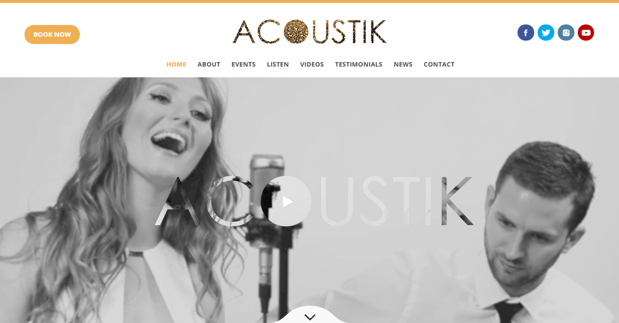
On the homepage, we developed a bespoke, parallax hero image that included multiple layers of blurred and non-blurred images overlaying a cropped Acoustik logo. Highlighting the ‘innovative’ nature of the design, this process was so new that we were unable to find any existing examples of the process anywhere online – we had to develop it entirely ourselves from scratch!
Throughout the site, we continued to push the design, creating a site-wide, universal aesthetic that was unmistakably resembling of the Acoustik branding.
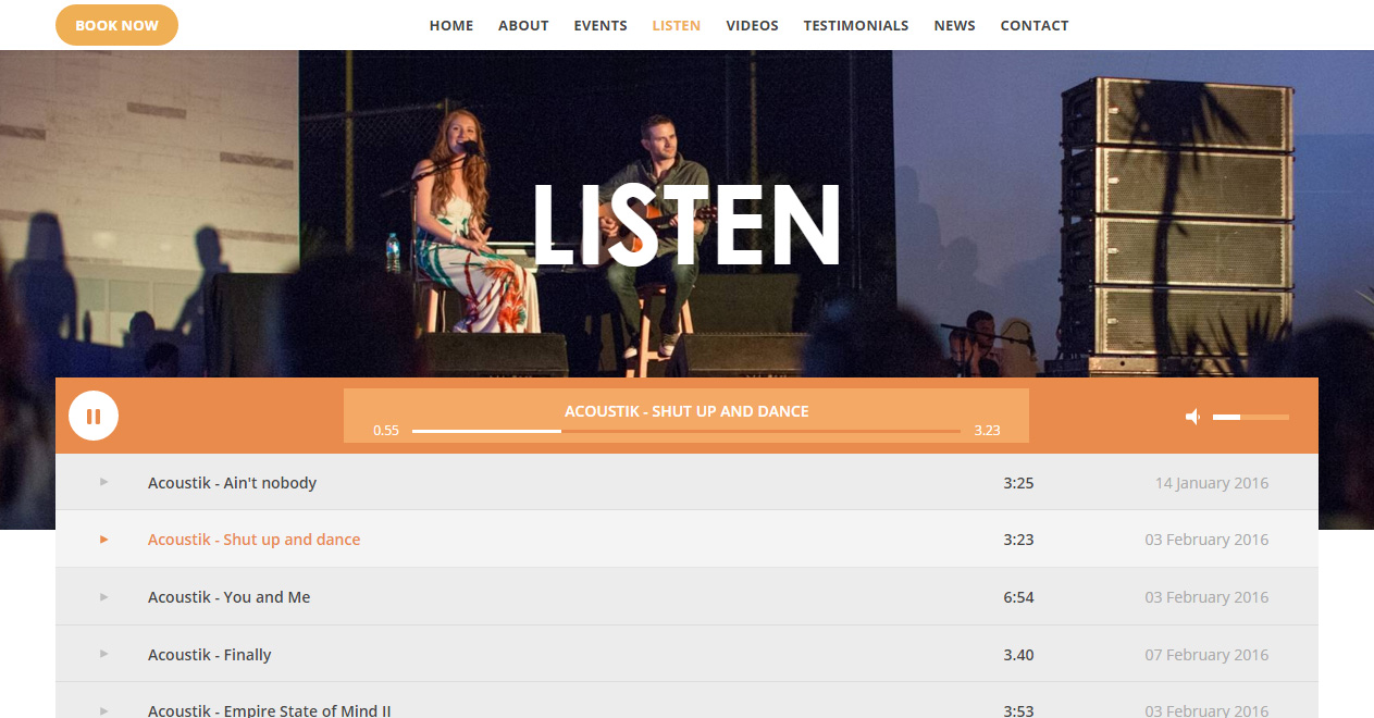
But we didn’t stop there. When we came to the ‘listen’ page, we were vexed that existing music players lacked the level of customisation that we required, and we refused to implement a music player that didn’t fit the aesthetic of the rest of the website. There was nothing for it – we decided to make our own!
The player we built was developed from the ground up to be light-weight and include only what was relevant and needed from the site, This gave it the edge over most external plugins, which typically have to include so many extra options to make them adaptable enough for their numerous different applications.
Our player was also fully integrated into the content management system, making it seamless, simple and easy to update.